


Colors reflect culture and carry profound meanings. Among the traditional Japanese colors, “朱色 (しゅいろ)” stands out for its vividness and historical significance, symbolizing the essence of Japanese color culture. This article explores the allure of Vermilion, delving into everything from its color codes to its western name, unveiling the depth of this captivating hue.
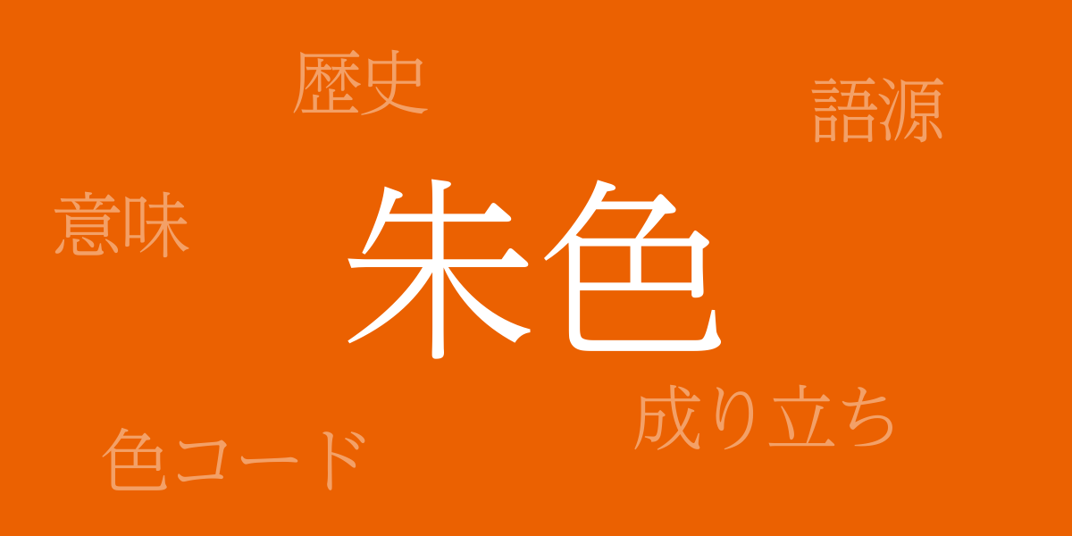
About 朱色 (しゅいろ)
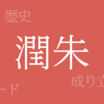
朱色 (しゅいろ), a vibrant mix of red and orange, has been used in Japan since ancient times for religious ceremonies and artworks. It symbolizes vitality and passion, uplifting spirits with its intensity. Vermilion also has protective qualities for materials like wood, making it a common choice for torii gates at shrines and statues.
History of 朱色
The history of Vermilion dates back to the Nara period, used in noble garments and architecture. During the Heian period, it signified aristocratic status, with vermilion-lacquered carriages and furniture symbolizing nobility. In the samurai society, Vermilion adorned armor and flags, representing bravery and dignity.
Color Codes for 朱色
Accurate reproduction of Vermilion in digital design and printing requires precise color codes:
- HEX: #EB6101
- RGB: R:235 G:97 B:1
- CMYK: C:8 M:75 Y:99 K:0
Western Name for 朱色
The western name for 朱色 is “Vermilion.” Derived from the mineral cinnabar used in the vivid red pigment, Vermilion has been used in artwork to convey rich color and depth.
Summary of 朱色
With its historical significance and vibrant coloration, Vermilion holds a special place among Japanese traditional colors. Symbolizing passion, energy, and nobility, it continues to captivate many. Using Vermilion can add depth and intensity to any work, whether in digital or print form. The fusion of Japanese tradition and modern design ensures that Vermilion will remain a beloved color for many more years.