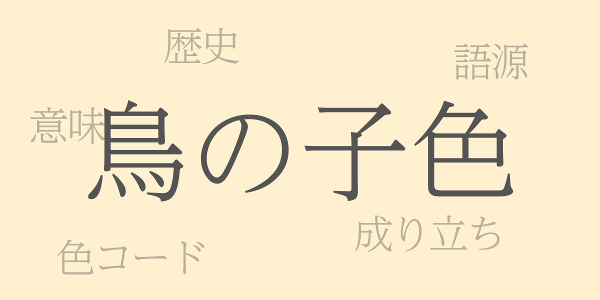
Japanese traditional colors are renowned worldwide for their unique shades and rich cultural significance. Among them, “Torinoko-iro (鳥の子色 – とりのこいろ)” is known for its soft and gentle hue, symbolizing the essence of Japanese aesthetics. This article delves into the allure of Torinoko-iro, exploring its history, color codes, and its Western name.
About Torinoko-iro (鳥の子色 – とりのこいろ)
Torinoko-iro, a traditional Japanese color, is a pale cream hue. Its name originates from the color used in Torinoko paper, reminiscent of the natural texture of washi (Japanese paper). This color is employed in Japanese paintings, kimonos, and even contemporary designs and fashion, providing a sense of calm and warmth.
The History of Torinoko-iro
The history of Torinoko-iro dates back to the Heian period, where it was already used in Torinoko paper. This type of paper was often used by nobility for correspondence and waka poems, cherished for its elegant appearance. Its gentle hue harmonizes with the changing seasons and natural beauty of Japan, deeply intertwining with Japanese aesthetic sensibilities.
Torinoko-iro Color Codes
For digital design and printing, the following color codes can be used to replicate Torinoko-iro:
- HEX: #FFF1CF
- RGB: R:255 G:241 B:207
- CMYK: C:1 M:8 Y:24 K:0
Western Name for Torinoko-iro
The closest Western names for Torinoko-iro are ‘Eggshell’ and ‘Cream.’ Eggshell represents the color of an egg’s shell, and Cream resembles the soft white of dairy cream. These names similarly evoke the natural and gentle impression of Torinoko-iro.
Summary on Torinoko-iro
Torinoko-iro, true to its name, is a traditional color with a natural hue seen in washi. It has colored Japanese aesthetic perceptions throughout history and is widely favored today in various design and fashion fields. By understanding its color codes, we can represent this beautiful color in digital and print media. Integrating Torinoko-iro into your life could bridge Japanese and Western aesthetics, enriching your surroundings.
