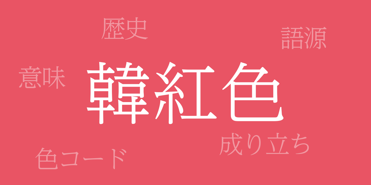
Color reflects emotions and narrates culture. The Japanese traditional color “韓紅色 (からくれない)” has symbolized the depth and vividness of Japanese aesthetics for centuries. This article delves into the allure of Karakurenai, exploring its history, color codes, and its western name. Let the deep crimson of Karakurenai guide you on a journey into the world of beauty.
About 韓紅色 (からくれないいろ)
韓紅色 (からくれないいろ) is a traditional Japanese color, its name originating from dyes that came from ancient Korea. Known for its deep crimson, this noble and serene shade has captivated many. It is commonly incorporated in traditional garments and crafts, and is frequently used in modern design, representing Japanese aesthetic values from ancient to contemporary times.
History of 韓紅色
The history of Karakurenai dates back to the Nara period and was already present in Japan. During the Heian period, it was used in noble garments, especially in the elaborate Junihitoe worn by women, where its color richness was highly prized. Throughout history, Karakurenai has maintained a high status, representing the pinnacle of Japanese dyeing techniques.
Color Codes for 韓紅色
In today’s digital design and web production, knowing accurate color codes is essential. Below are the color codes for Karakurenai:
- HEX: #E95464
- RGB: R:233 G:84 B:100
- CMYK: C:9 M:81 Y:49 K:0
Western Name for 韓紅色
The western name for Karakurenai is “Carmine”. Originating from the Latin ‘carminium’, it refers to a dye made from cochineal insects. Like Karakurenai, Carmine represents a deep red hue, and is highly regarded worldwide.
Summary of 韓紅色
With its beauty and profound history, Karakurenai holds an unshakeable position as a traditional Japanese color. Even in the digital age, by understanding its color codes, we can share the charm of Karakurenai globally. As a fusion of tradition and modernity, Karakurenai will continue to captivate hearts around the world.

